Deep dive: Questionnaire visualization in Power BI
| Warning | Work in progress! We are in the process of updating the information on this page. Subject to change. |
In the following steps, we describe the process of displaying answers collected on the questionnaire in the Power BI report. To describe the process, we came up with a simple use case to guide you through. We tried to keep the steps as general as possible so that you can apply the steps in your use case.
Use case
Answers from the questionnaire are stored in the JSON format. The string of this JSON is then stored in the resco_serializedanswer field within the Questionnaire entity. We can use Power BI to transform (parse) the JSON and visualize the data collected in the questionnaires.
It's essential to have a precise understanding of what you want to visualize before you start working on the report. We will illustrate a straightforward scenario wherein we visualize responses gathered from a questionnaire for a mobile elevator work platform. This questionnaire has question group "01 Inspection start". This question group contains two questions we plan to visualize in the report.

Questions we want to visualize: The first question is, "Can the device be inspected?". The answers to this question are in the form of Yes/No. On the report, we want to count the number of Yes and No answers.
The second question "Reason" is visible only if the previous question, "Can the device be inspected?" was answered No. We will display the number of different reasons on the pie chart.
Entities we use:
The entities we will use in the report: Account, Asset, Workorder and Questionnaire.
The logic behind our use case is following. Account owns an Asset. We have scheduled Workorder for this Asset. The objective of the Workorder is to perform an inspection, which results in Questionnaire.
Report:
The report we are going to work on contains:
Filters (Slicers):
- Account filter
- Workorder/Asset filter
- Inspector filter
- Timeline filter
Visualizations:
- 2 Cards
- Stacked bar chart
- Donut chart
This is the report we want to achieve at the end of this guide.

Get data into the Power Bi Desktop
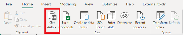
- First, import the data from the backend. Click Get Data in the top bar.
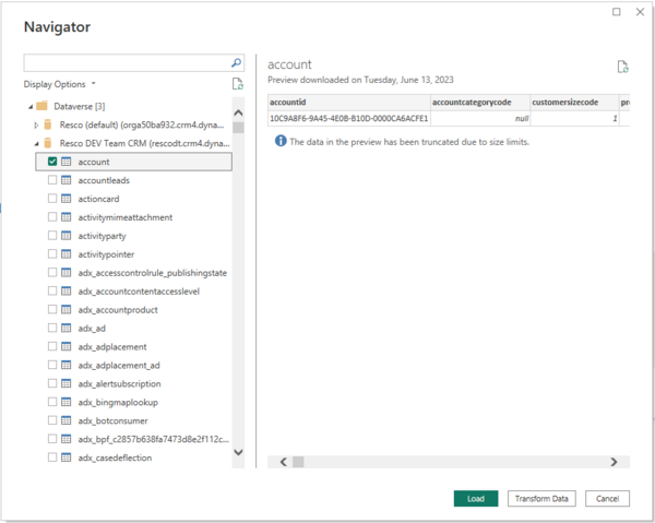
- If you are working with Dataverse, enter "Dataverse". If you are working with Salesforce, enter "Salesforce objects". Connect to the selected backend. Select the entities you wish to visualize in the Navigator window on your report.
- Once every entity you need is selected, click Transform Data.
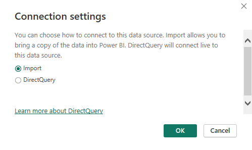
- A connection settings window will pop up. Now, we have two options: Import mode and DirectQuery mode. Select Import mode.


Data cleaning
Now that we are in the Power Query editor, we should perform simple data cleaning. Data cleaning depends on your scenario. Generally, we can start by removing columns we do not need.
- Filter the Questionnaire entity by completion status and serialized answer field. We want only those questionnaires that are completed and contain JSON string.
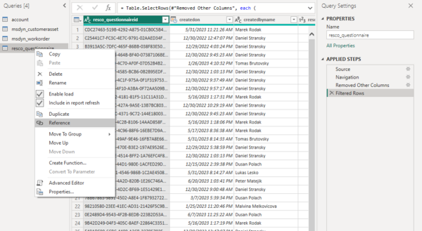
- Once we have performed data cleaning, it's time to create a new query where we parse the JSON. Start by creating a reference from the Questionnaire query. Right-click on the resco_questionnaire query in the Query pane and click Reference.
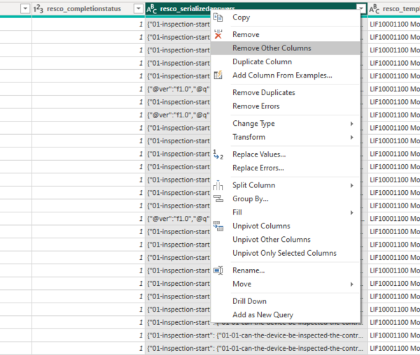
- In the new query, filter out the rest of the questionnaire templates so only the template you wish to visualize is present. Once this step is done, let's isolate the resco_serializedanswers column containing the JSON.
- Right-click on the column header and click Remove other columns.


Transforming (parsing) JSON
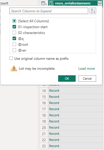
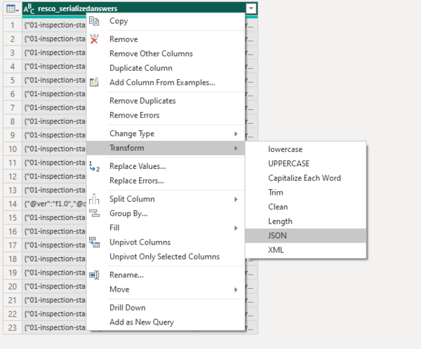
Now that the resco_serializedanswers column is isolated, it's time to parse the JSON.
- Right-click on the header of the resco_serializedanswers column, go to Transform, and click JSON.
- The JSON records have now been transformed into nested records. To see the record's contents and later expand it, click the expand button (right corner of the column header).