Questionnaire Designer examples
This article describes several useful examples of using the Questionnaire Designer.
Automatically fill fields using On Load rule
You might want that some fields are automatically filled in when a user starts the questionnaire.
- Open On Load rule editor on a questionnaire.
- Set up a rule with the following logic:
- Add the condition If the questionnaire is new.
- Add Step: For the question Date and Time set the value to now.
- Add Step: For the question Filled by set the value to the current user.
- Save the rule, questionnaire, and test it in the application.

Access parent entity from On Load rule
The following example is similar to the example above, however, we want to fill in fields from the parent record of the questionnaire. In this case, it's actually a grandparent: The questionnaire's parent is the appointment from which it was initiated, and we want to add fields from the appointment's account to the questionnaire.
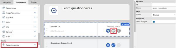
- Add the regarding lookup component to your questionnaire. You can make it invisible in the app if you want. The component behaves just like a simple question, however, it is filled in automatically by the appointment reference from which the questionnaire is opened.
- Click On Load to open the rule editor.
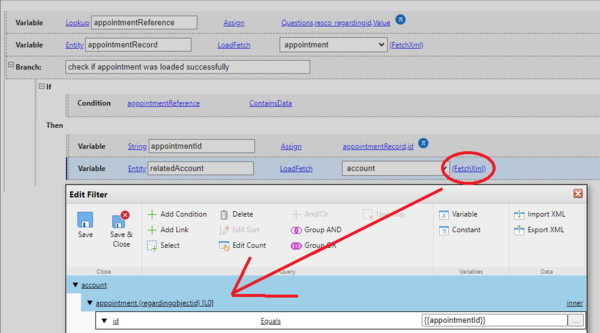
- Create a local variable (lookup type) and load the regarding lookup into it.
- Create a local variable (entity type) and load the parent appointment based on the reference.

- Check if the appointment was loaded successfully, then save the appointment ID to a string variable and use the ID to find the account.
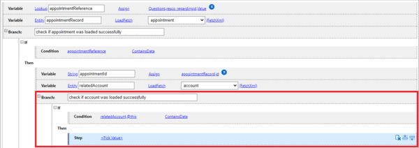
- Check if the account was loaded successfully, then you can start adding steps that fill in questionnaire fields from the related account entity.


Show additional question depending on previous answer using On Change rule
When a user answers a question in a certain way, you might want to display additional questions. For example, married users need to provide the name of their partner.
- Create a group with two questions:
- A single choice question: Are you married? (Answers: Yes, No.)
- A text question: Partner name. Invisible by default
- Select the first question and click On Change.
- Set up a rule with the following logic:
- Add the condition If: If the answer to the are-you-married question is Yes.
- Add Step: Then set visibility for the question partner-name to True.
- Add Else.
- Add Step: Else set visibility for the question partner-name to False.
- Save the rule, questionnaire, and test it in the application.

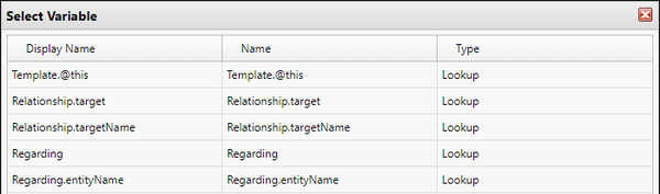
You can now use fetch variable {{Regarding}} to access (related) entity of activity, if the activity is regarding the record of the questionnaire. This means that you can reuse previous answers from a specific appointment, or a specific asset if opened through an appointment.
- Edit a questionnaire template in Questionnaire Designer.
- Select the top level of the questionnaire to display its properties.
- Set Reuse Answers to your preferred option other than Never.
- In the Reuse Fetch, click Modify.
- The default filter has four conditions.
- Click Add Condition and add the following condition:
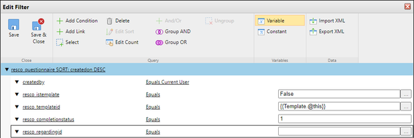
- Click Variable and select Regarding, then click OK.
- Click Add Condition and add the following condition:
- Click Save & Close to close the filter editor, then click Save & Close to save the questionnaire template.


Add custom icon for questionnaire group
It is possible to add a custom icon for a question group in questionnaires.
- Edit an app project in Woodford.
- Select Design > Images from the Project menu.
- Create a folder called "Questionnaire".
- Add an icon with a name that matches the question group name.
- Save everything and publish the app project.

Group icons deep dive
If your questionnaire includes multiple groups, you can switch between groups in the app. On Android and iOS, you can swipe down to display the list of questionnaire groups. On Windows, you can click the questionnaire caption to display this list.
Default group icons
There are actually 3 default icons:
- Standard
- Selected
- Complete
As you can see in the app on the screenshots above, the standard icon is not used in the questionnaire body. It is used when switching groups using the group list. The same applies to the "selected" icon. It is only visible on Android/iOS; on Windows devices, the behavior is slightly different and the icon is not used.
The "complete" icon is used for groups that you mark as complete using rules. See Track group completion below.
The default "standard" and "selected" icon reuse the assets from the general form tab. You can change the default icon, but it will also affect your forms. The dash at the end of "General-" indicates that it's the "selected" icon.

The default "complete" icon is hardcoded in the app. You can upload your own default icon for completed groups: it belongs to the "Questionnaire" folder with the name "-complete".
Custom group icons
As described above, you can add custom icons. The standard file name must match the name of the questionnaire group. Add the "-" suffix for selected icons and "-complete" suffix for complete icons.

Track group completion
For each question group, you can track the completion percentage using rules. For example, you can make a group complete when all questions in the group are answered. Select the question group in the designer and add a suitable On Change rule.

A direct implication visible in the app is that the icon of the question group changes to "complete" (either default or custom). This allows the inspector to quickly see which question groups are done and which need answering. You can also tie further business logic to the completion. The following example of an On Can Execute rule enables a command when 3 groups are complete.
