Flexible form: Difference between revisions
| Line 89: | Line 89: | ||
As you decrease the available screen width: | As you decrease the available screen width: | ||
* First, the right panel changes to a single column. | * First, the right panel changes to a single column. | ||
* | * Later, the content of both panels is combined into a single panel. Initially, this single panel can have two columns. At this point, Resco app attempts to arrange the tabs in a way that uses the available screen space effectively. | ||
* Eventually, tabs are placed below each other, single panel, single column. | |||
[[File:Flexible form layout narrow screen.png|400px]] | [[File:Flexible form layout narrow screen.png|400px]] | ||
[[Category:Woodford]] | [[Category:Woodford]] | ||
Revision as of 16:10, 16 March 2023
Forms are one of the components of mobile apps. Flexible forms offer an alternate rendering of forms. All form tabs are displayed simultaneously; users no longer have to switch between tabs. Flexible forms work particularly well with larger screens, where users get a perfect overview of any record at a glance.
A potential disadvantage of flexible forms is speed. The entire form is loaded every time, resulting in a higher number of database requests (and API calls in online mode) compared to the tabbed view (where tabs are loaded on demand).
Enabling flexible forms
Flexible forms need to be enabled in the project's configuration. If you don't enable them, the classic UI using tabs is used.
- Edit an app project.
- Select Configuration from the Project menu.
- Set Full-screen Forms to True. This option applies to tablets only and determines whether forms open in full-screen mode or one column.
- Set Flexible Forms to True. This option enables flexible forms.
Configuring layout
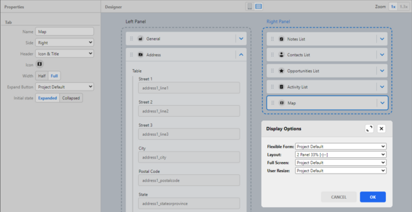
Edit a form and click Form Layout to set up its display options.
- Flexible Form
- Project Default – Form is displayed in old or new UI, depending on the Flexible Form setting in the project’s Configuration.
- Enable – Enables the New UI Form.
- Disable – Form with tabs will be used.
| Note | Per-form setting has priority over project configuration. |
- Layout (Applicable for tablet devices when the form is in full screen)
- Single Panel – Form is displayed in one column; all items are below each other, like on phone devices.
- 2 Panel Auto – Right or left panel covers more space (depending on the content – which panel has more items on it).
- 2 Panel 33% – Right panel is larger.
- 2 Panel 66% – Left panel is larger.
- Full Screen
- Project Default – The form follows the project settings.
- Enable – Form opens in full screen.
- Disable – Form opens in one column.
- User Resize
- Project Default – The form follows the project settings.
- Enable – User can resize the form (switch between full screen and single-column mode).
- Disable – User cannot resize the form.
Setting up tab properties
For additional tweaking, you can configure the properties of each tab or list.
- Side
- Set whether the tab should be displayed in the left or right panel. By default, the detail tab (where you can add entity fields) is set to be on the left panel, and the associated or unrelated list is on the right. Users can rearrange it as they wish.
- Header
- Select what to show on the tab’s header. Options are:
- Hidden – This tab won’t have a header.
- Icon & Title – The icon and the title (tab name) will be shown.
- Title – Only the tab name will be shown.
- Width
- Set the tab's width to full (entire panel) or half (on wide screens, two tabs can be placed next to each other).
- Height
- If the tab is a list view, it means the number of rows (other rows are accessible with a scrollbar); otherwise, it is the number of "segments" of a pre-defined height. The height can also be defined in pseudo-pixels (e.g., 100px). To learn more about it, check this webinar. Webinar
Configuring flexible forms in the app
To enable flexible forms in Resco apps, tap Setup and enable Appearance > New Form UI.
App behavior details
In some circumstances, the app displays forms in two panels:
- Two panels are only available for flexible forms.
- One of the two-panel layouts has to be selected.
- Full-screen mode is not mandatory, but the screen must be wide enough.
One of the panels is narrow, and the other is wide, as determined by the Layout parameter.
Use the Side parameter to determine where (in which panel) a tab is displayed. Or simply drag a tab to the other panel.
Depending on the screen width, each panel can display tabs in one or two columns. If you want to ensure that a form tab occupies the full width of the panel, set Width to "Full".
Example
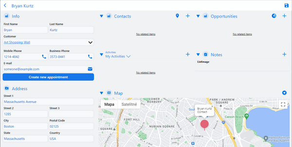
In the example below, two-panel layout is configured. The left panel is narrow (33%).
The right panel is wide enough to display tabs in two columns. All tabs use half width - except the Map tab; that's why it uses the full width of the right panel.
On even wider screens, also the left panel will start displaying its tabs in two columns.
As you decrease the available screen width:
- First, the right panel changes to a single column.
- Later, the content of both panels is combined into a single panel. Initially, this single panel can have two columns. At this point, Resco app attempts to arrange the tabs in a way that uses the available screen space effectively.
- Eventually, tabs are placed below each other, single panel, single column.


