Theme: Difference between revisions
| Line 32: | Line 32: | ||
== Brand color, dark mode == | == Brand color, dark mode == | ||
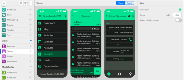
{{Preview|Since [[Releases/Summer 2023|release 16.1]], a simpler way of selecting colors is available. Select the '''Brand color''' and Woodford automatically | {{Preview|Since [[Releases/Summer 2023|release 16.1]], a simpler way of selecting colors is available. Select the '''Brand color''' and Woodford uses an [https://github.com/material-foundation/material-color-utilities algorithm by Material Design] to automatically generate a color palette for light and dark themes built around the brand color. Users can switch between light and dark using [[Setup|Setup/Settings]].}} | ||
[[File:Theme-editor-brand-color-dark-mode.png|600px]] | [[File:Theme-editor-brand-color-dark-mode.png|600px]] | ||
== Advanced color settings and tokens == | |||
{{Preview|If you need to fine-tune the colors, enable '''Advanced color settings'''.}} | |||
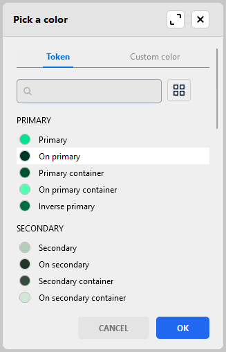
When picking a color for a UI element, you have two options: | |||
* Directly select a custom color. | |||
* Select a token (which also has a color). | |||
Tokens are named colors that can be defined once and reused at various locations in the app, similar to [https://m3.material.io/foundations/design-tokens/overview Material Design's design tokens]. | |||
[[File:Theme-color-picker-with-tokens.png]] | |||
Revision as of 11:34, 31 July 2023
| Branding and customization |
|---|
The default colors in the Resco Mobile CRM app can be modified by tweaking the theme. This allows you to apply your corporate colors to the app.
Edit an app project and select Theme from the Project menu of Woodford to alter the theme.
View styles set for specific field(s) on a view have higher priority and override the theme color settings. To learn more about view styles, see View styles. You can also check Row scripts.
Changing the theme
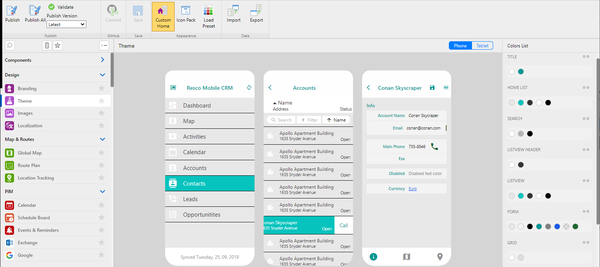
Setup is WYSIWYG. You can click on any sections on the preview to change its color. The changes are displayed immediately in the preview. You can also switch between phone view and tablet view.
The Colors List pane on the right displays a list of unique color styles used in the app. You can click each item to select a replacement color.
| Hint | Colors set for ListForeground and ListSelForeground for Views and TabForeground and TabSelForeground for tab are also used for icons, that were colorized, when importing via Images section. |
Click Custom Home to switch to an alternative design of the Home screen.
Click Icon Pack and select one of the predefined icon packs. Icons are not replaced in the preview.
- Default
- Modern2018
- Scandinavian
Click Load Preset to revert all changes and return to any of the pre-configured themes:
- Default (blue)
- Modern (different blue)
- Scandinavian (teal)
You can export the current theme setup and download it using the Export button (for example, to use it in another project). Click Import to upload a theme file and apply it.
Brand color, dark mode
Advanced color settings and tokens
When picking a color for a UI element, you have two options:
- Directly select a custom color.
- Select a token (which also has a color).
Tokens are named colors that can be defined once and reused at various locations in the app, similar to Material Design's design tokens.
{{#CI form: title = Was this information helpful? How can we improve? | type = inputs | [textarea] }}


