Chart: Difference between revisions
Designing charts in the app |
|||
| (13 intermediate revisions by 2 users not shown) | |||
| Line 1: | Line 1: | ||
{{UI Components TOC}} | {{UI Components TOC}} | ||
Chart views are | Chart views are an optional component of mobile apps. The main purpose of a chart is to display a list of records of a particular [[entity]] on a graph. Records can be grouped by a field and you can display per-group aggregate values, such as count, count of distinct values, sum, minimum, maximum, or average value. | ||
Charts are defined for each entity. A single entity can have multiple charts. If an entity has at least one chart, app users can switch to charts from a view. | |||
There are two options where to define charts: | There are two options where to define charts: | ||
* Woodford administrators can create and manage charts available for all users in an app project. | * Woodford administrators can create and manage charts available for all users in an app project. | ||
* App users can create and manage their private charts. | * App users can create and manage their private charts. | ||
[[File:Stacked chart.png|alt=Stacked chart example|600px]] | |||
== Managing charts in Woodford == | == Managing charts in Woodford == | ||
| Line 18: | Line 22: | ||
# Select a chart type on the toolbar, for example Donut. | # Select a chart type on the toolbar, for example Donut. | ||
# Specify which fields should be displayed on the charts on the '''Properties''' pane. | # Specify which fields should be displayed on the charts on the '''Properties''' pane. | ||
# Optionally, if you want to limit the displayed values, click '''Edit Filter''' and create a filtering rule. | # Optionally, if you want to limit the displayed values, click '''[[Filter editor|Edit Filter]]''' and create a filtering rule. | ||
# Click '''Save & Close''' to finish the chart. | # Click '''Save & Close''' to finish the chart. | ||
An example of multi series chart setup can be found in our [ | An example of a multi-series chart setup can be found in our [https://www.resco.net/blog/create-charts-with-multiple-series/ Blog Post]. {{Badge|Blog}} | ||
== Adding charts to your app in Woodford == | == Adding charts to your app in Woodford == | ||
| Line 27: | Line 31: | ||
Charts can be added to your app in two ways. | Charts can be added to your app in two ways. | ||
* When an entity with | * When an entity with at least one chart is available on the [[Home screen]], users can switch their view to a chart view. You can even make chart view the default initial view: Double-click the entity on the Home screen to display its properties, switch to the '''Charts''' tab and check '''Initial View'''. | ||
* Charts are one of the possible components on a dashboard. See [[Dashboard]] for more information. | * Charts are one of the possible components on a dashboard. See [[Dashboard]] for more information. | ||
| Line 33: | Line 37: | ||
# Tap '''[[Setup]]''' on the [[home screen]]. | # Tap '''[[Setup]]''' on the [[home screen]]. | ||
# Scroll down to ''' | # Scroll down to '''My customizations''' section and tap '''Private Charts''' to display a list of your private charts. | ||
# To create a new chart, tap the + button and select an entity. | # To create a new chart, tap the + button and select an entity. | ||
# Enter a name. | # Enter a name. | ||
# Select the chart type and enter additional properties. | # Select the chart type and enter additional properties. | ||
# Tap Save. | # Tap '''Save'''. | ||
Your new chart is now available as an alternate rendering of the entity. Select the entity from home screen, then use the buttons in the top right corner to toggle between list, map, and charts view. | |||
[[File:Flipping-between-view-map-chart.mp4|600px|alt=flipping between view map chart]] | |||
== Example: Opportunities per year and account == | |||
In this example, we want to list the sum of estimated revenue from opportunities per year. Within each year, we want to see the values for each customer. | |||
# Edit an app project. | |||
# Select '''Entities > Opportunity''' from the '''Project''' menu, then click '''Show UI'''. | |||
# Click '''New Chart''' and name it. | |||
# Choose a '''Column''' chart and select '''Est. Revenue''' (summed) as your legend entries. | |||
# Use '''Created On''' (Year) and '''Potential Customer''' on your horizontal axis label. | |||
# Save all changes and publish the project. | |||
# Synchronize the app and switch the view for opportunities to the chart view. | |||
# You can use the controls in the app to switch between stacked and grouped view, and you can also modify the time period for grouping. | |||
[[File:Setting up a chart.png|alt=Setting up a chart propeties|145px]] [[File:Grouped chart.png|alt=grouped chart example|455px]] | |||
== Tip: Order by series aggregate == | |||
By default, records in charts are sorted by "Axis" label. When you define a limit for the "Series" aggregate, the sorting order changes to the "Series" aggregate value. This is because Resco assumes that when you want to see only top/bottom set of values, you are most probably interested in seeing them in order. | |||
You must also remove any explicit sort you added in '''Edit Filter'''. | |||
[[File:Set-limit-to-sort-by-series.png|600px|alt=define a limit for the series to enable sorting by series]] | |||
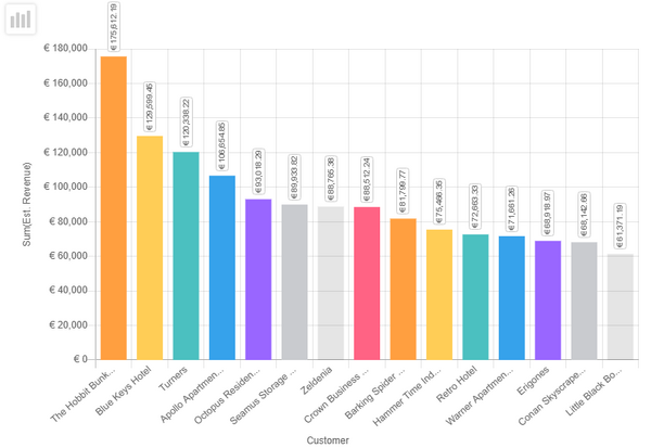
In the app, the values in the chart are ordered by aggregate series. | |||
[[File:Chart-ordered-by-aggregate.png|600px|alt=chart ordered by aggregate]] | |||
== Charts with JSBridge == | |||
You can also configure charts using JavaScript. | |||
# Select the entity in the '''Project''' menu and click '''Show UI'''. | |||
# Click '''New Chart''' and name it, then click '''OK'''. | |||
# Click '''iFrame''' to configure external datasource. | |||
#* As '''Url''', enter a link to an HTML file with the chart (or click '''Browse''' and select the file from your [[Offline HTML]] folder). Click '''Manage''' if you need to upload the file. | |||
#* Check '''Provides Data Source'''. | |||
# Click '''OK''' and then save the chart. All other properties in chart configuration are ignored. | |||
{{Note|JavaScript datasource for charts is not supported if you have legacy charts enabled via [[Configuration#Legacy|configuration]].}} | |||
=== Sample template === | |||
<syntaxhighlight lang="html"> | |||
<!DOCTYPE html> | |||
<html> | |||
<head> | |||
<meta charset="utf-8" /> | |||
<title>Data_Sample1</title> | |||
<!-- Activate IE9 document mode, if available. --> | |||
<!-- If missing, the WebBrowser control on Windows runs in default IE8 mode which is not supported by JSBridge. --> | |||
<meta http-equiv='X-UA-Compatible' content='IE=edge' /> | |||
<!-- Defined iOS viewport --> | |||
<!-- If missing, the UIWebView control on iOS zooms out the web page and allows the pinch zoom. --> | |||
<meta name='viewport' content='initial-scale=1, minimum-scale=1, maximum-scale=1, user-scalable=no'> | |||
<!-- JSBridge must be explicitly included, otherwise the bridge is not accessible from Javascript. --> | |||
<script type='text/javascript' src='../../APPX/www/JSBridge.js'></script> | |||
</head> | |||
<body> | |||
<h3>Welcome to sample page.</h3> | |||
<p>Example shows how to set custom data source on entity list view.</p> | |||
Help: <a href="https://github.com/Resconet/JSBridge">Git repository...</a> | |||
<script> | |||
function setDataSource() { | |||
var dataSource = new MobileCRM.UI.ChartDataSource(); | |||
//dataSource.loadOfflineData = { type : 'line', data : { | |||
// //Chart column labels | |||
// labels: ['M', 'T', 'W', 'T', 'F', 'S', 'S'], | |||
// datasets: [{ | |||
// label: 'Apples', | |||
// //Chart column values | |||
// data: [12, 19, 3, 17, 6, 3, 7], | |||
// //backgroundColor: Only for multiple datasets | |||
// backgroundColor: "#D93600" | |||
// }] | |||
// } | |||
//}; | |||
dataSource.loadCustomFetch = function () { | |||
var fetch = this.fetch; | |||
var filter = new MobileCRM.FetchXml.Filter(); | |||
var parentNotNullCondition = new MobileCRM.FetchXml.Condition(); | |||
parentNotNullCondition.attribute = "ownerid"; | |||
parentNotNullCondition.operator = "not-null"; | |||
var conditionStartsWith = new MobileCRM.FetchXml.Condition(); | |||
conditionStartsWith.attribute = "name"; | |||
conditionStartsWith.operator = "like"; | |||
conditionStartsWith.value = "W%"; | |||
filter.conditions.push(parentNotNullCondition, conditionStartsWith); | |||
filter.type = "and"; | |||
var originalFilter = fetch.entity.filter; | |||
if (originalFilter && originalFilter.conditions != null) { | |||
var combinedFilter = new MobileCRM.FetchXml.Filter(); | |||
combinedFilter.type = "and"; | |||
combinedFilter.filters = [filter, originalFilter]; | |||
fetch.entity.filter = combinedFilter; | |||
} | |||
else | |||
fetch.entity.filter = filter; // Set the new filter to fetch entity | |||
fetch.execute("DynamicEntities", function (entities) { | |||
// This is the final place to manipulate with the array of loaded entities before it is passed to the EntityList. | |||
}, MobileCRM.bridge.alert, this); | |||
}; | |||
MobileCRM.UI.EntityChart.setDataSource(dataSource); | |||
} | |||
/** Call this before document load finishes (only if iFrame is marked to 'Provide data source' */ | |||
setDataSource(); | |||
</script> | |||
</body> | |||
</html> | |||
</syntaxhighlight> | |||
[[Category:Woodford]] | [[Category:Woodford]] | ||
Latest revision as of 12:32, 22 July 2025
Chart views are an optional component of mobile apps. The main purpose of a chart is to display a list of records of a particular entity on a graph. Records can be grouped by a field and you can display per-group aggregate values, such as count, count of distinct values, sum, minimum, maximum, or average value.
Charts are defined for each entity. A single entity can have multiple charts. If an entity has at least one chart, app users can switch to charts from a view.
There are two options where to define charts:
- Woodford administrators can create and manage charts available for all users in an app project.
- App users can create and manage their private charts.
Managing charts in Woodford
Charts are associated with an entity. To see a list of charts for an entity, edit an app project, select the entity and click Show UI.
On the Mobile Views, Forms and Charts screen, you can add, clone, or remove charts, edit them and change their properties, as well as export them (to a file in XML format) or import them (for example, to a different app project).
Creating a chart in Woodford
- Select the entity in the Project menu and click Show UI.
- Click New Chart and name it, then click OK.
- Select a chart type on the toolbar, for example Donut.
- Specify which fields should be displayed on the charts on the Properties pane.
- Optionally, if you want to limit the displayed values, click Edit Filter and create a filtering rule.
- Click Save & Close to finish the chart.
An example of a multi-series chart setup can be found in our Blog Post. Blog
Adding charts to your app in Woodford
Charts can be added to your app in two ways.
- When an entity with at least one chart is available on the Home screen, users can switch their view to a chart view. You can even make chart view the default initial view: Double-click the entity on the Home screen to display its properties, switch to the Charts tab and check Initial View.
- Charts are one of the possible components on a dashboard. See Dashboard for more information.
Designing charts in the app
- Tap Setup on the home screen.
- Scroll down to My customizations section and tap Private Charts to display a list of your private charts.
- To create a new chart, tap the + button and select an entity.
- Enter a name.
- Select the chart type and enter additional properties.
- Tap Save.
Your new chart is now available as an alternate rendering of the entity. Select the entity from home screen, then use the buttons in the top right corner to toggle between list, map, and charts view.
Example: Opportunities per year and account
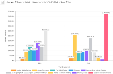
In this example, we want to list the sum of estimated revenue from opportunities per year. Within each year, we want to see the values for each customer.
- Edit an app project.
- Select Entities > Opportunity from the Project menu, then click Show UI.
- Click New Chart and name it.
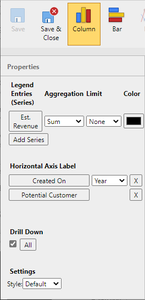
- Choose a Column chart and select Est. Revenue (summed) as your legend entries.
- Use Created On (Year) and Potential Customer on your horizontal axis label.
- Save all changes and publish the project.
- Synchronize the app and switch the view for opportunities to the chart view.
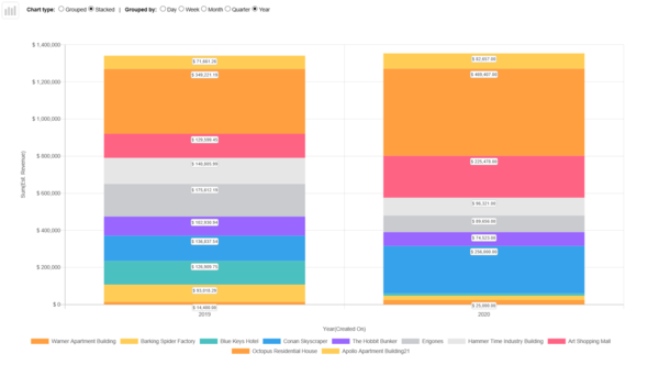
- You can use the controls in the app to switch between stacked and grouped view, and you can also modify the time period for grouping.
Tip: Order by series aggregate
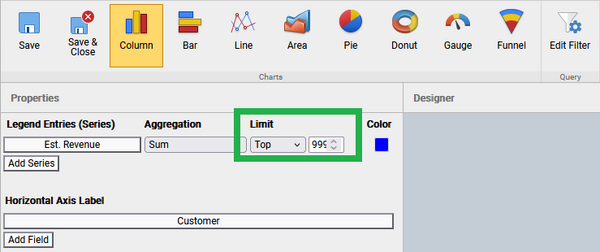
By default, records in charts are sorted by "Axis" label. When you define a limit for the "Series" aggregate, the sorting order changes to the "Series" aggregate value. This is because Resco assumes that when you want to see only top/bottom set of values, you are most probably interested in seeing them in order.
You must also remove any explicit sort you added in Edit Filter.
In the app, the values in the chart are ordered by aggregate series.
Charts with JSBridge
You can also configure charts using JavaScript.
- Select the entity in the Project menu and click Show UI.
- Click New Chart and name it, then click OK.
- Click iFrame to configure external datasource.
- As Url, enter a link to an HTML file with the chart (or click Browse and select the file from your Offline HTML folder). Click Manage if you need to upload the file.
- Check Provides Data Source.
- Click OK and then save the chart. All other properties in chart configuration are ignored.
| Note | JavaScript datasource for charts is not supported if you have legacy charts enabled via configuration. |
Sample template
<!DOCTYPE html>
<html>
<head>
	<meta charset="utf-8" />
	<title>Data_Sample1</title>
	<!-- Activate IE9 document mode, if available. -->
	<!-- If missing, the WebBrowser control on Windows runs in default IE8 mode which is not supported by JSBridge. -->
	<meta http-equiv='X-UA-Compatible' content='IE=edge' />
	<!-- Defined iOS viewport -->
	<!-- If missing, the UIWebView control on iOS zooms out the web page and allows the pinch zoom. -->
	<meta name='viewport' content='initial-scale=1, minimum-scale=1, maximum-scale=1, user-scalable=no'>
	<!-- JSBridge must be explicitly included, otherwise the bridge is not accessible from Javascript. -->
	<script type='text/javascript' src='../../APPX/www/JSBridge.js'></script>
</head>
<body>
	<h3>Welcome to sample page.</h3>
	<p>Example shows how to set custom data source on entity list view.</p>
	Help: <a href="https://github.com/Resconet/JSBridge">Git repository...</a>

	<script>
	function setDataSource() {
		var dataSource = new MobileCRM.UI.ChartDataSource();

		//dataSource.loadOfflineData = { type : 'line',  data : {
		//		//Chart column labels
		//		labels: ['M', 'T', 'W', 'T', 'F', 'S', 'S'],
		//		datasets: [{
		//			label: 'Apples',
		//			//Chart column values
		//			data: [12, 19, 3, 17, 6, 3, 7],
		//			//backgroundColor: Only for multiple datasets
		//			backgroundColor: "#D93600"
		//		}]
		//	}
		//};

		dataSource.loadCustomFetch = function () {
			var fetch = this.fetch;
			var filter = new MobileCRM.FetchXml.Filter();
			var parentNotNullCondition = new MobileCRM.FetchXml.Condition();
			parentNotNullCondition.attribute = "ownerid";
			parentNotNullCondition.operator = "not-null";
			var conditionStartsWith = new MobileCRM.FetchXml.Condition();
			conditionStartsWith.attribute = "name";
			conditionStartsWith.operator = "like";
			conditionStartsWith.value = "W%";
			filter.conditions.push(parentNotNullCondition, conditionStartsWith);
			filter.type = "and";
			var originalFilter = fetch.entity.filter;
			if (originalFilter && originalFilter.conditions != null) {
				var combinedFilter = new MobileCRM.FetchXml.Filter();
				combinedFilter.type = "and";
				combinedFilter.filters = [filter, originalFilter];
				fetch.entity.filter = combinedFilter;
			}
			else
				fetch.entity.filter = filter; // Set the new filter to fetch entity

			fetch.execute("DynamicEntities", function (entities) {
				// This is the final place to manipulate with the array of loaded entities before it is passed to the EntityList.
			}, MobileCRM.bridge.alert, this);
		};
		MobileCRM.UI.EntityChart.setDataSource(dataSource);
	}
        /** Call this before document load finishes (only if iFrame is marked to 'Provide data source' */
        setDataSource();

	</script>

</body>
</html>
