Theme: Difference between revisions
| (9 intermediate revisions by the same user not shown) | |||
| Line 10: | Line 10: | ||
Setup is WYSIWYG. You can click on any sections on the preview to change its color. The changes are displayed immediately in the preview. You can also switch between phone view and tablet view. | Setup is WYSIWYG. You can click on any sections on the preview to change its color. The changes are displayed immediately in the preview. You can also switch between phone view and tablet view. | ||
[[File:Theme editor.png|600px]] | [[File:Theme editor.png|600px|alt=theme editor in Woodford - main screen]] | ||
The '''Colors List''' pane on the right displays a list of unique color styles used in the app. You can click each item to select a replacement color. | The '''Colors List''' pane on the right displays a list of unique color styles used in the app. You can click each item to select a replacement color. | ||
{{Note|Colors set for ListForeground and ListSelForeground for [[View]]s and TabForeground and TabSelForeground for tab are also used for icons, that were [[Images#Colorize|colorized]], when importing via [[Images]] section.|Hint}} | {{Note|Colors set for ListForeground and ListSelForeground for [[View]]s and TabForeground and TabSelForeground for tab are also used for icons, that were [[Images#Colorize|colorized]], when importing via [[Images]] section.|Hint}} | ||
<!-- | |||
Click '''Custom Home''' to switch to an alternative design of the [[Home screen]] (function removed in [[Releases/Summer_2023|Release 16.1]]). | Click '''Custom Home''' to switch to an alternative design of the [[Home screen]] (function removed in [[Releases/Summer_2023|Release 16.1]]). | ||
| Line 22: | Line 22: | ||
* Modern2018 | * Modern2018 | ||
* Scandinavian | * Scandinavian | ||
--> | |||
Click '''Load Preset''' to revert all changes and return to | Click '''Load Preset''' to revert all changes and return to a pre-configured theme: | ||
* Default | * Default | ||
* Inspections | |||
* | |||
You can export the current theme setup and download it using the '''Export''' button (for example, to use it in another project). Click '''Import''' to upload a theme file and apply it. | You can export the current theme setup and download it using the '''Export''' button (for example, to use it in another project). Click '''Import''' to upload a theme file and apply it. | ||
| Line 32: | Line 31: | ||
== Brand color, dark mode == | == Brand color, dark mode == | ||
Since [[Releases/Summer 2023|release 16.1]], a simpler way of selecting colors is available. Only select a single '''Brand color'''. Woodford uses an [https://github.com/material-foundation/material-color-utilities algorithm by Material Design] to automatically generate a color palette for light and dark themes built around the brand color. The algorithm ensures that the generated colors offer sufficient contrast and meet accessibility requirements. | |||
Users can switch between light and dark using [[Setup|Setup/Settings]]. | Users can switch between light and dark using [[Setup|Setup/Settings]]. | ||
[[File:Theme-editor-brand-color-dark-mode.png|600px]] | [[File:Theme-editor-brand-color-dark-mode.png|600px|alt=theme editor brand color dark mode]] | ||
== Advanced color settings and tokens == | == Advanced color settings and tokens == | ||
If you need to fine-tune the colors, enable '''Advanced color settings'''. | |||
When picking a color for a UI element, you have two options: | When picking a color for a UI element, you have two options: | ||
| Line 48: | Line 47: | ||
Tokens are named colors that can be defined once and reused at various locations in the app, similar to [https://m3.material.io/foundations/design-tokens/overview Material Design's design tokens]. | Tokens are named colors that can be defined once and reused at various locations in the app, similar to [https://m3.material.io/foundations/design-tokens/overview Material Design's design tokens]. | ||
[[File:Theme-color-picker-with-tokens.png]] | [[File:Theme-color-picker-with-tokens.png|alt=theme editor, color picker, design tokens]] | ||
== Cards == | |||
Cards are flexible-size containers that group related information. [[Resco mobile apps]] use card design in two places: | |||
* In [[flexible form]]s, each form tab is a card | |||
* In questionnaires, each question group is a card | |||
You can use the theme editor to set card colors to make your cards stand out. Colors allow users to distinguish quickly where cards start and end. | |||
# Edit an [[app project]] in [[Woodford]]. | |||
# Go to '''Design > Theme'''. | |||
# Enable '''Advanced color settings'''. | |||
# Scroll down to '''Card''' section and set up the colors, then save all changes.<br>[[File:Card-colors-in-theme-editor.png|alt=Card colors in theme editor]]<br>"Background" refers to the header background, "Foreground" to primary text and icon in the header, "Interactive items" to header elements that users can interact with such as expand/collapse, view selector, etc. | |||
In the app, cards can add to clarity for complex forms or questionnaires. | |||
[[File:Sample-form-with-distinct-card-design.png|600px|alt=sample flexible form with card design configured]] | |||
== Views and home screen == | |||
Views and home screen of the app may share the same color scheme. | |||
* Disable '''Custom Home''' to reuse view colors also for home. | |||
* Eanble '''Custom Home''' if you want to set up separate colors for the home screen. See [[Home_screen#Custom_colors_and_design|Custom colors and design]] for more information about tweaking your home screen. | |||
[[File:Custom-home-button-enabled.png|600px|alt=Display separate color tokens for home screen]] | |||
Latest revision as of 12:47, 21 January 2025
| Branding and customization |
|---|
The default colors in the Resco Mobile CRM app can be modified by tweaking the theme. This allows you to apply your corporate colors to the app.
Edit an app project and select Theme from the Project menu of Woodford to alter the theme.
View styles set for specific field(s) on a view have higher priority and override the theme color settings. To learn more about view styles, see View styles. You can also check Row scripts.
Changing the theme
Setup is WYSIWYG. You can click on any sections on the preview to change its color. The changes are displayed immediately in the preview. You can also switch between phone view and tablet view.

The Colors List pane on the right displays a list of unique color styles used in the app. You can click each item to select a replacement color.
| Hint | Colors set for ListForeground and ListSelForeground for Views and TabForeground and TabSelForeground for tab are also used for icons, that were colorized, when importing via Images section. |
Click Load Preset to revert all changes and return to a pre-configured theme:
- Default
- Inspections
You can export the current theme setup and download it using the Export button (for example, to use it in another project). Click Import to upload a theme file and apply it.
Brand color, dark mode
Since release 16.1, a simpler way of selecting colors is available. Only select a single Brand color. Woodford uses an algorithm by Material Design to automatically generate a color palette for light and dark themes built around the brand color. The algorithm ensures that the generated colors offer sufficient contrast and meet accessibility requirements.
Users can switch between light and dark using Setup/Settings.

Advanced color settings and tokens
If you need to fine-tune the colors, enable Advanced color settings.
When picking a color for a UI element, you have two options:
- Directly select a custom color.
- Select a token (which also has a color).
Tokens are named colors that can be defined once and reused at various locations in the app, similar to Material Design's design tokens.

Cards
Cards are flexible-size containers that group related information. Resco mobile apps use card design in two places:
- In flexible forms, each form tab is a card
- In questionnaires, each question group is a card
You can use the theme editor to set card colors to make your cards stand out. Colors allow users to distinguish quickly where cards start and end.
- Edit an app project in Woodford.
- Go to Design > Theme.
- Enable Advanced color settings.
- Scroll down to Card section and set up the colors, then save all changes.
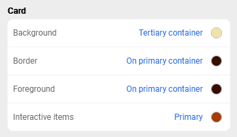
"Background" refers to the header background, "Foreground" to primary text and icon in the header, "Interactive items" to header elements that users can interact with such as expand/collapse, view selector, etc.

In the app, cards can add to clarity for complex forms or questionnaires.

Views and home screen
Views and home screen of the app may share the same color scheme.
- Disable Custom Home to reuse view colors also for home.
- Eanble Custom Home if you want to set up separate colors for the home screen. See Custom colors and design for more information about tweaking your home screen.

{{#CI form: title = Was this information helpful? How can we improve?
| type = inputs
| [textarea]
}}